Contact Details
sales@thrasker.com (813) 565-9024 10901 Danka Circle North, Suite BSt.Petersburg FL 33704

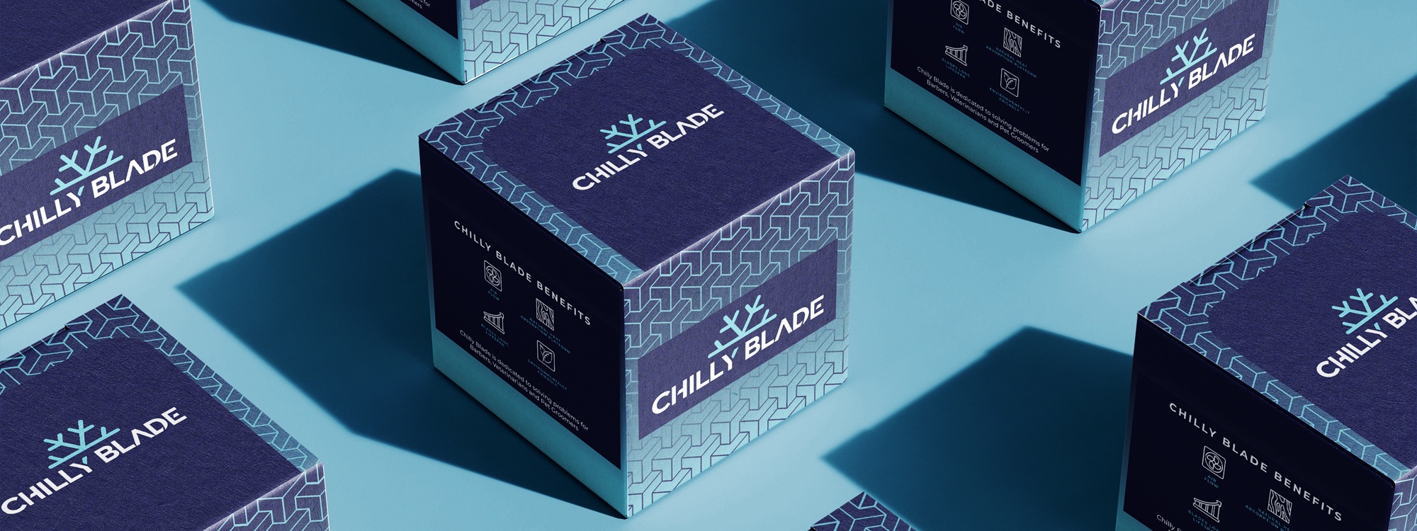
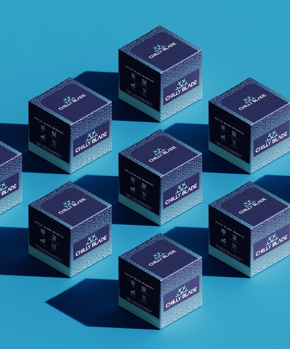
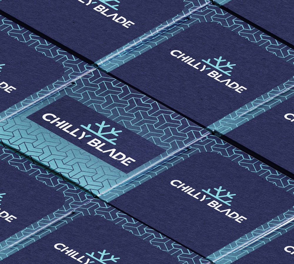
The "Chilly Blade" blade cleaning packaging design is meticulously crafted to capture the essence of efficiency and freshness. The packaging showcases a distinct visual identity that aligns with the brand's commitment to quality and innovation. The central focus of the packaging is the Chilly Blade logo, which is elegantly positioned within a navy rectangle. This separation ensures that the logo remains prominent and instantly recognizable, serving as a visual anchor for the product. The logo itself represents the brand's professionalism and effectiveness in blade cleaning.


The design process for the "Chilly Blade" blade cleaning packaging commenced with a comprehensive exploration of the brand's identity and values. Thorough research into the blade cleaning industry and consumer preferences provided crucial insights for the packaging's visual direction.
The primary objective was to create a packaging design that conveyed both efficiency and freshness. The central placement of the Chilly Blade logo within a navy box was a deliberate choice to ensure its prominence and instant recognition. The logo encapsulates the brand's professionalism and effectiveness in blade cleaning.
The background design evolved around a captivating gradient, carefully crafted to add depth and visual intrigue. The gradient's journey commenced with a refreshing icy blue shade at the bottom, symbolizing coolness and cleanliness. As it ascended, the gradient seamlessly transitioned into a rich navy blue, signifying reliability and trustworthiness.
The chosen color palette, with its cool and rich hues, effectively communicated the brand's core promise of delivering revitalizing and efficient blade cleaning solutions. The design thus resonated with the brand's values while catering to the target audience's aspiration for both quality and freshness.
