Contact Details
sales@thrasker.com (813) 565-9024 10901 Danka Circle North, Suite BSt.Petersburg FL 33704

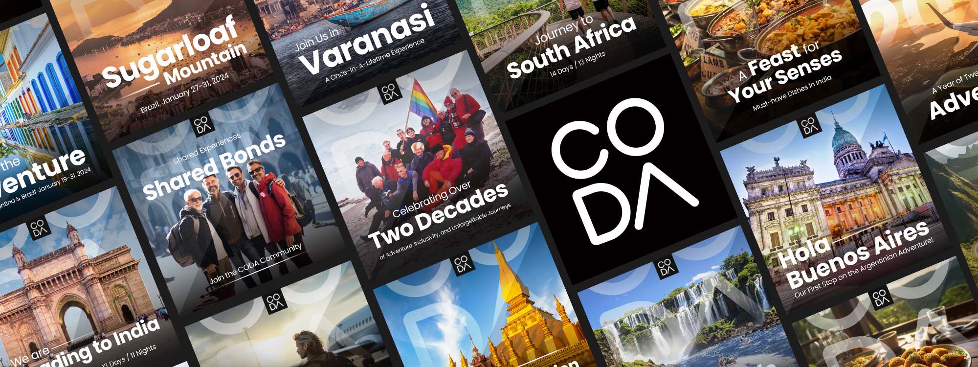
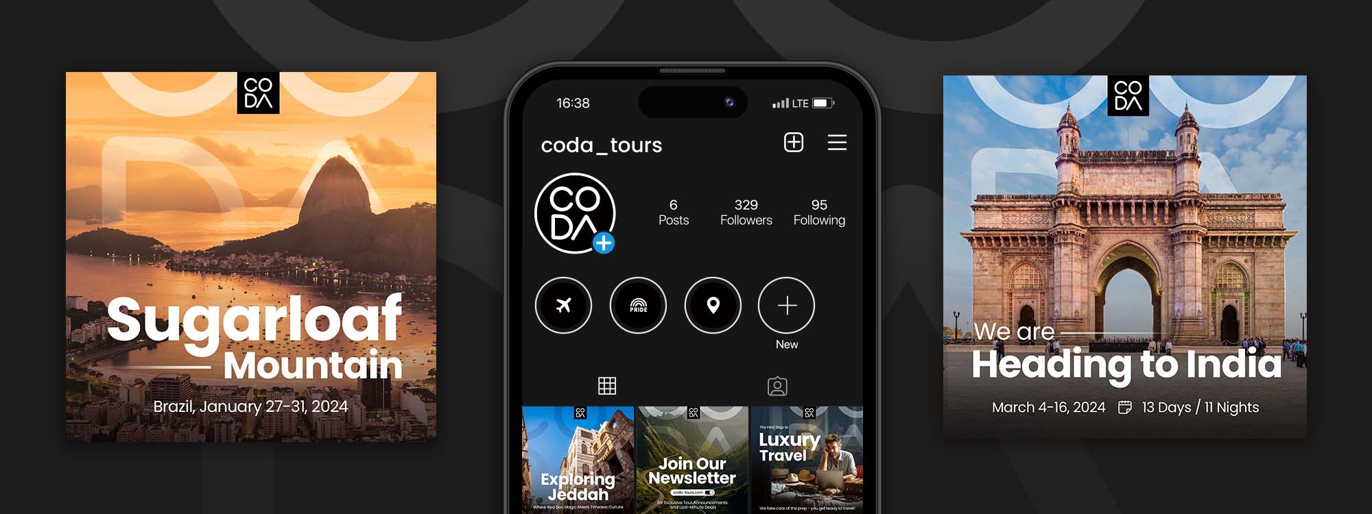
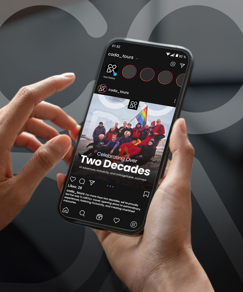
The social media designs for CODA Tours present a cohesive and vibrant visual identity that's aimed at captivating the audience's attention and invoking a sense of wanderlust. Each design is crafted to convey specific information about the travel experiences offered while maintaining brand consistency and visual appeal. Here's an in-depth look at the key elements of these designs:
The visuals utilize a rich, diverse color palette that resonates with the destinations featured. From the serene blues reflecting the Brazilian seascape to the warm, earthy tones embodying the Indian landscape, each image is tailored to evoke the ambiance of its respective location. The consistent placement of the CODA Tours logo across all designs fosters brand recognition, with its prominent white color contrasting effectively against the varying backgrounds.
The typography choices in these designs are deliberate to ensure readability and hierarchy of information. Bold, sans-serif fonts are used for the main titles such as "Sugarloaf Mountain" and "Varanasi," immediately drawing the viewer’s eye. Subtitles and descriptive texts are in a smaller font size but retain the clarity, guiding the viewer through the content in a logical flow.


Each design includes a clear call-to-action, whether it's an
invitation to "Join us in Varanasi" or a prompt to "Explore Jeddah."
This strategic placement ensures that viewers are not just passive
observers but are encouraged to envision themselves taking part in
these experiences.
Altogether, these designs are more than just visually appealing;
they tell a story and convey a message. They invite the audience
into a world of exploration and shared experiences, emphasizing the
core values of CODA Tours. The thoughtful use of design elements
like color, typography, and imagery work in harmony to produce a
compelling visual narrative that is likely to resonate with the
target audience and inspire them to engage with the brand.
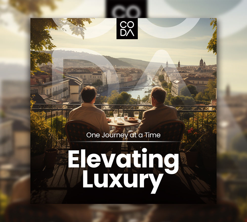
The images chosen for each post are vibrant and dynamic, showcasing the destinations and experiences in an engaging manner. They range from iconic landmarks like the Sugarloaf Mountain in Brazil and the Gateway of India to intimate moments such as a group photo of travelers or a table set for a luxurious meal. This blend of imagery not only highlights the beauty and diversity of the destinations but also emphasizes the communal and luxurious aspects of the travel experiences.
The layouts are clean and modern, with a structured composition that allows each element to breathe. The use of space is masterful, with neither text nor images overwhelming the other. Some designs feature a zig-zag pattern that dynamically leads the eye across the content, creating a sense of movement and energy.
The designs exhibit a commendable level of cultural sensitivity and inclusivity, highlighting CODA Tours' commitment to adventure, inclusivity, and unforgettable journeys. This is particularly evident in images showing groups of diverse individuals and in the inclusive language used in the texts.
