Contact Details
sales@thrasker.com (813) 565-9024 10901 Danka Circle North, Suite BSt.Petersburg FL 33704

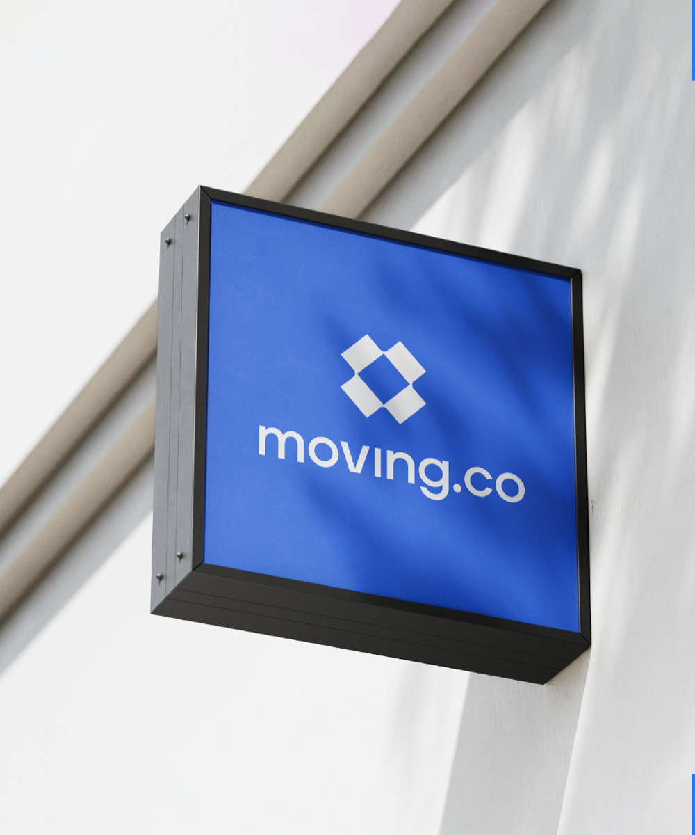
The logo for Moving.co is a visually appealing and meaningful representation of a search engine specifically designed for the moving industry. The primary focus of the logo is a typography-based design featuring bold letters and a clean, modern sans serif font. This choice of typography exudes professionalism, simplicity, and efficiency, aligning with the purpose of a search engine.


The standout feature of the logo is the distinct mark is incorporated to enhance the visual appeal and add symbolism to the design.
This mark takes the form of an illustration depicting a box from a bird's-eye view. The box symbolizes the act of moving and represents the core service provided by Moving.com – facilitating and assisting users in their relocation process. The bird's-eye view perspective adds a unique touch, providing a sense of overview and organization.
The logo creation process for Moving.co involved a collaborative effort between designers. Through brainstorming and iteration, they crafted a visually striking and modern logo. The result is a memorable and effective representation of Moving.co’s purpose and values.


The Moving.co logo's empathy map considers the target audience's perspective. Users seeking relocation services value a trustworthy, professional, and efficient logo. Clean typography and bold design elements establish credibility and reliability. Overall, the logo for Moving.com effectively communicates the purpose of the search engine, combines typography and an illustrative mark to create a visually compelling design, and aligns with the brand's values and objectives.
