Contact Details
sales@thrasker.com (813) 565-9024 10901 Danka Circle North, Suite BSt.Petersburg FL 33704

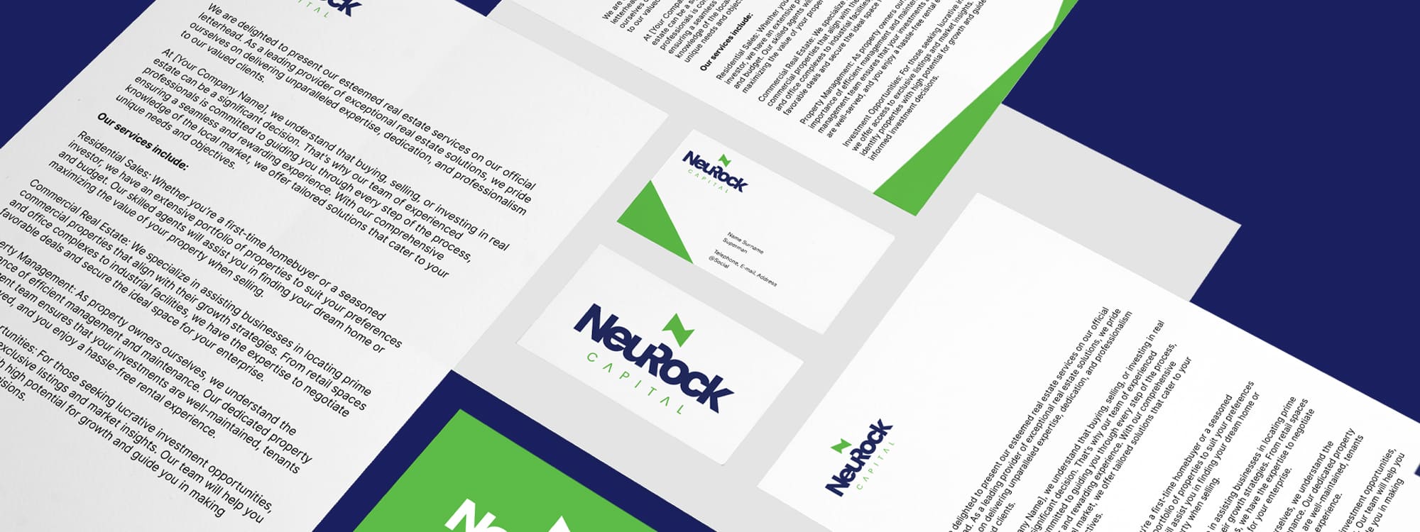
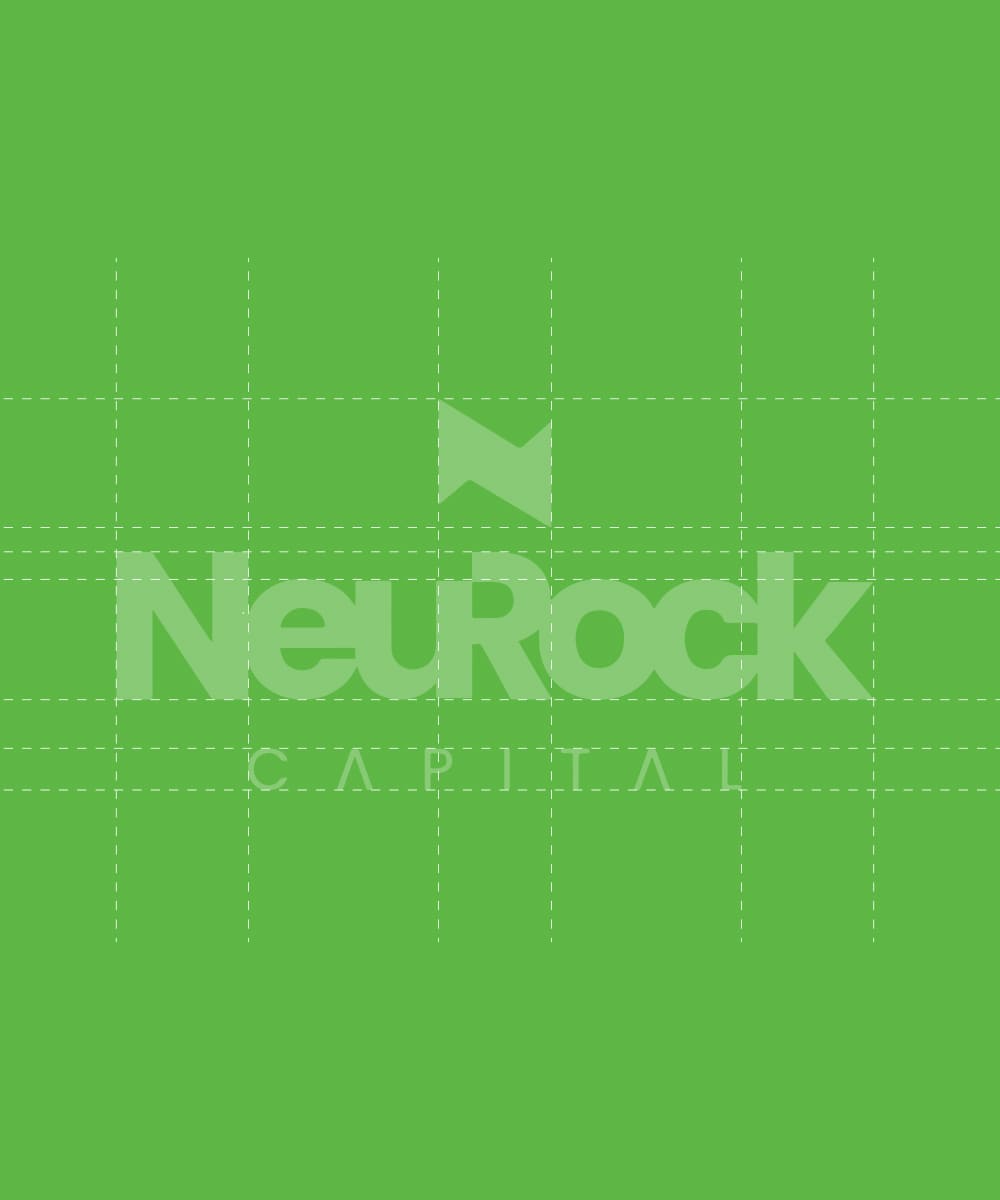
The Neurock Capital logo design is a powerful and dynamic representation of the company's vision and values. It embraces a typography-based approach that combines bold letterforms with a distinctive logo mark to create a memorable and impactful brand identity. The centerpiece of the logo design is the typography, meticulously crafted with bold and commanding letterforms. The letters are carefully chosen to evoke a sense of strength, professionalism, and confidence. Their boldness communicates the company's unwavering commitment to excellence and their ability to navigate the complexities of the financial world.


Above the typography, a small logo mark is incorporated to enhance the visual appeal and add a unique touch to the design. This logo mark serves as a visual representation of the company's core values, industry focus, or a symbol that resonates with the target audience. It could be an abstract icon, a stylized representation of a financial concept, or a combination of relevant elements that represent Neurock Capital's expertise and forward-thinking approach. The color palette chosen for the logo design reflects the company's sophistication and trustworthiness. Deep and authoritative colors such as navy blue, charcoal gray, or dark green can be utilized to convey a sense of stability and professionalism. These colors also ensure that the logo remains timeless and can adapt to different applications and platforms.
