Contact Details
sales@thrasker.com (813) 565-9024 10901 Danka Circle North, Suite BSt.Petersburg FL 33704

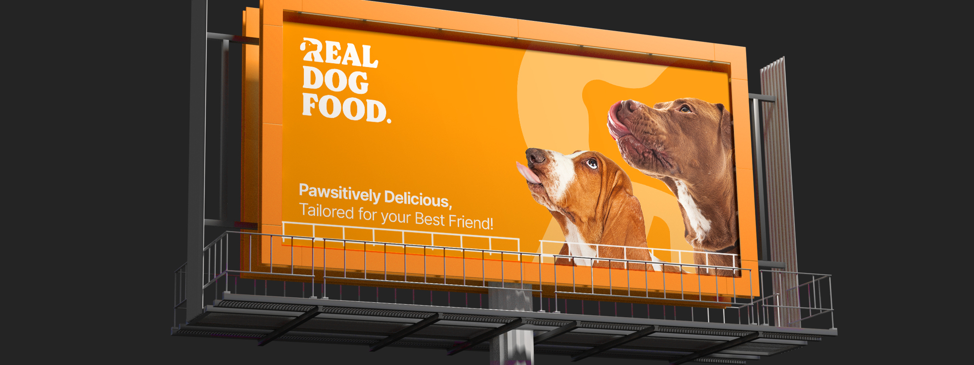
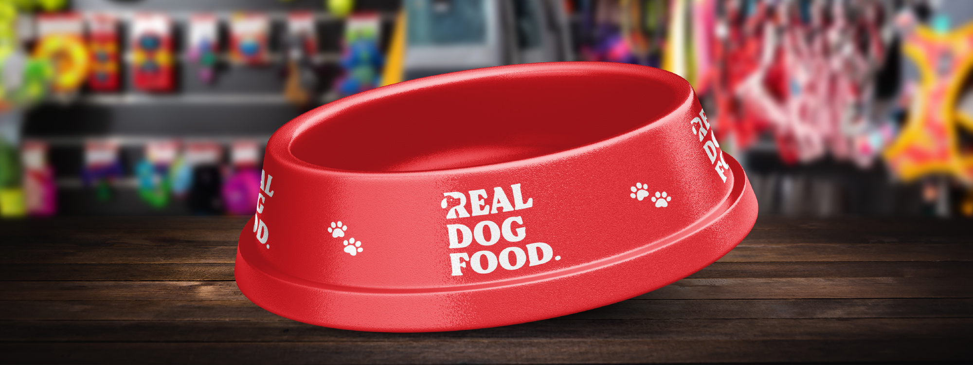
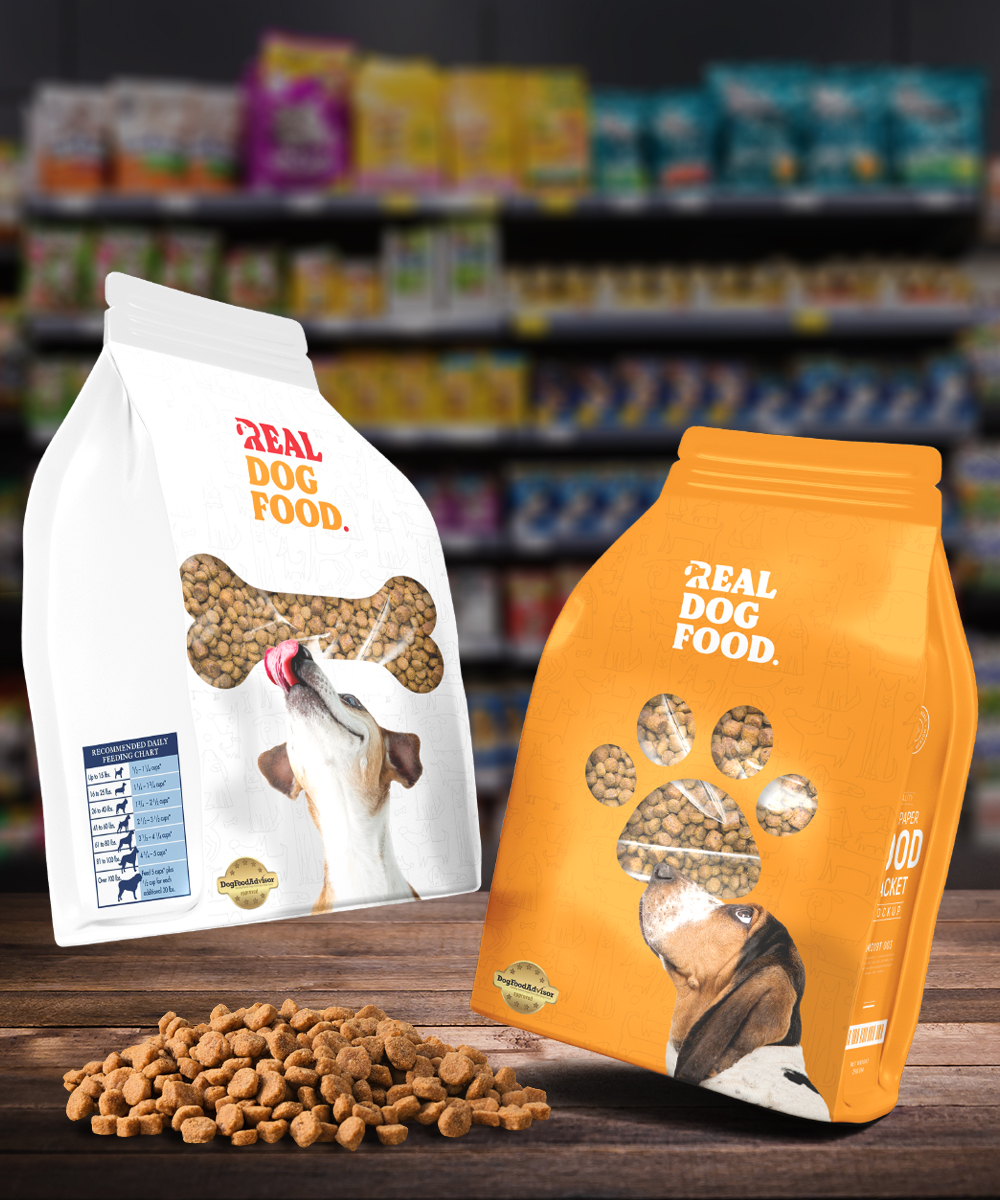
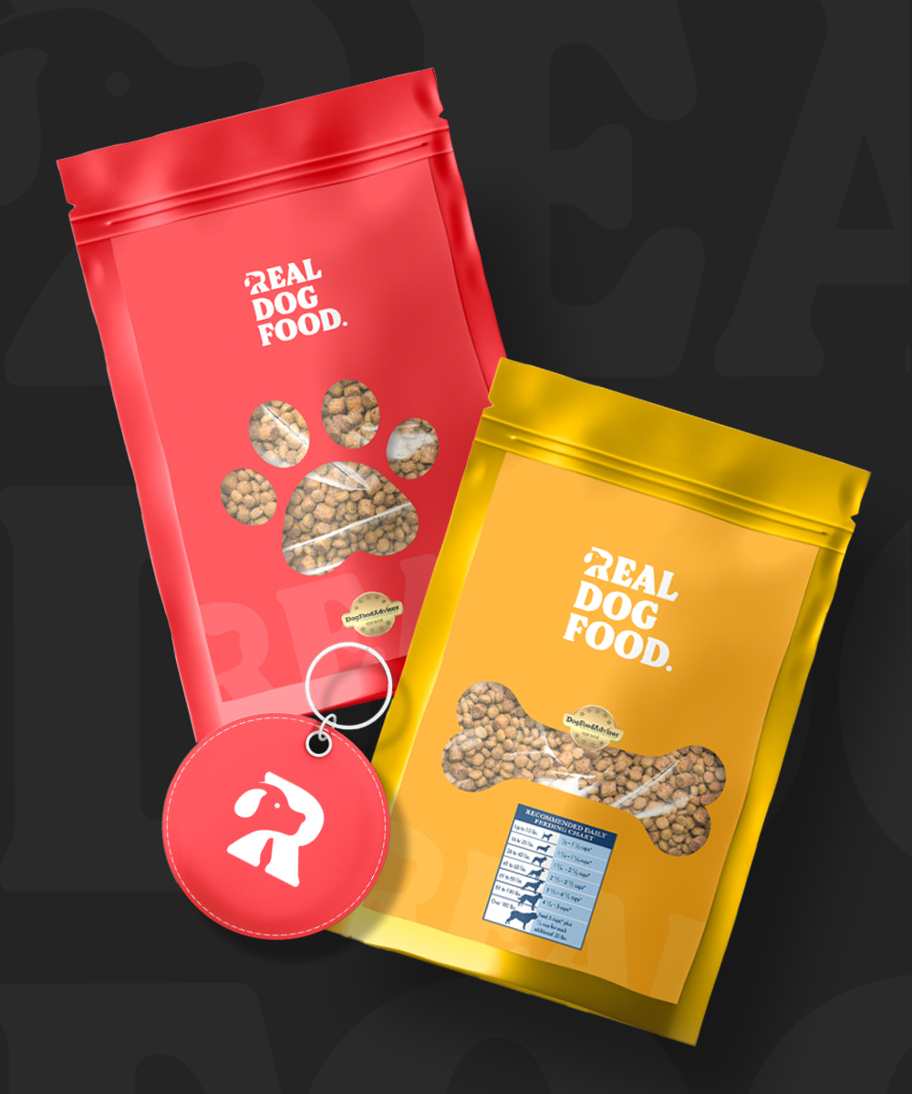
The logo is designed to capture the essence of the brand's focus on dog food while maintaining a sleek and modern aesthetic. It consists of a typography-based design with a unique twist in the letter 'R.' The typography is clean, bold, and legible, reflecting the brand's professionalism and trustworthiness


The primary feature of the logo is the letter 'R,' which has been
creatively modified to incorporate a silhouette of a dog. The dog
silhouette is carefully crafted to be instantly recognizable,
portraying the energetic and friendly nature of dogs. The dog's
body flows seamlessly within the letter, with attention given to
capturing the distinct characteristics of a dog, such as the
outline of the head, ears, and tail.
To enhance the visual impact, the dog silhouette within the 'R'
can be filled with a vibrant color that complements the brand's
identity.
Overall, this typography logo with the dog silhouette incorporated into the letter 'R' captures the brand's dedication to providing high-quality and nutritious dog food, while also showcasing their love for dogs. It conveys a sense of trust, reliability, and a connection to nature, making it an impactful and memorable representation of the brand.
